Breeze everywhere

The first half of this year, I had the chance to work on icon and design for two big free-software projects.

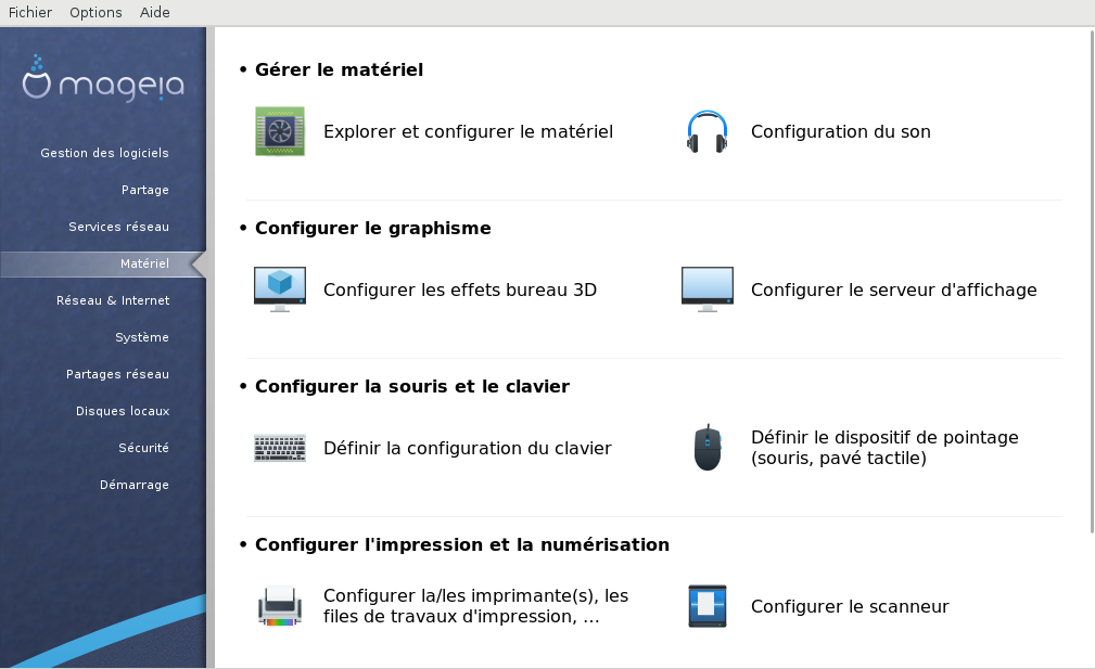
First, I’ve been hired to work on Mageia. I had to refresh the look for Mageia 6, which mostly meant making new icons for the Mageia Control Center and all the internal tools.

mageia-MCC

I proposed to replace the oxygen-like icons with some breeze-like icons.
This way it integrates much better with modern desktop, and of course it looks especially good with plasma.

mageia-MCC01

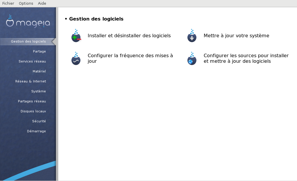
The result is around 1/3 of icons directly imported from breeze, 1/3 are modified versions and 1/3 are created from scratch. I tried to follow as much as possible the breeze guidelines, but had to adapt some rules to the context.

mageia-MCC02

I also made a wallpaper to go with it, which will be in the extra wallpaper package so not used by default:

Mageia-Default-1920x1200
available in different sizes on this link.

And another funny wallpaper for people that are both mageia users and Pepper & Carrot fans:

Extra-Background-01-PepperAndCarrot-1080
available in different sizes on this link
(but I’m not sure yet if this one will be packaged at all…)

Note that we still have some visual issues with the applets.
It seems to be a problem with how gtkcreate_pixbuf is used. But more important, those applet don’t even react to clic in plasma (while this seems at least to work fine in all other desktop).
Since no one seems to have an easy fix or workaround yet, if someone has an idea to help…

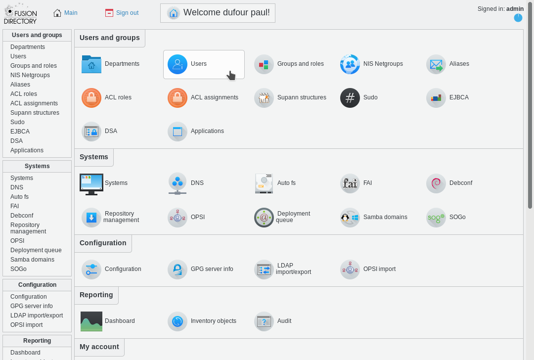
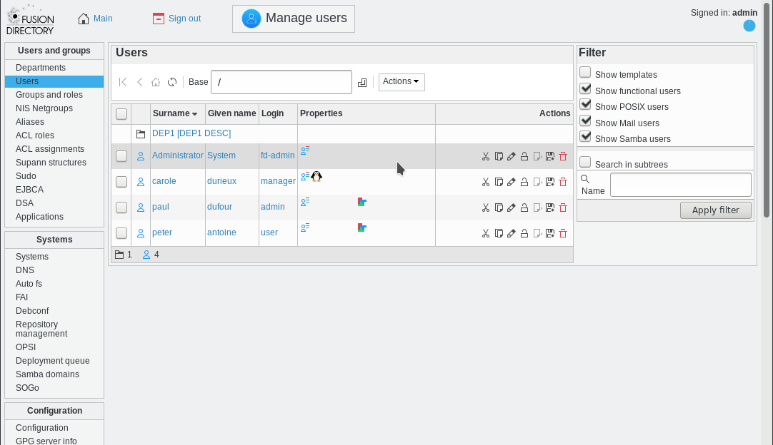
Soon after I finished my work on Mageia, I’ve been hired to work on fusiondirectory.
I had to create a new theme for the web interface, and again I proposed to base it on breeze, similar to what I did for Mageia but in another different context. Also, I modified the CSS to look like breeze-light interface theme. The result theme is called breezy, and is now used by default since the last release.

FD-Breezy01
FD-Breezy02

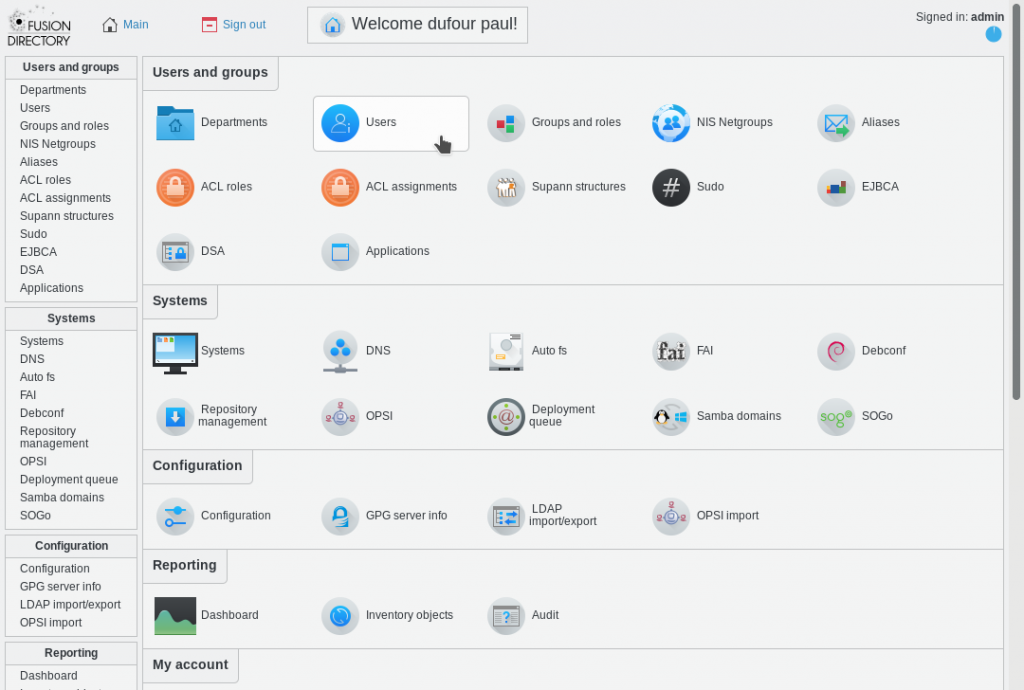
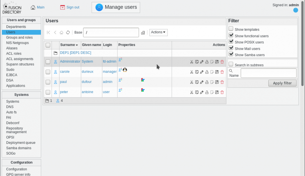
I had a lot of positive feedback on this new theme, people seem to really like it.

Before to finish, a special side note for the breeze team: Thank you so much for all the great work! It has been a pleasure to start from it. Feel free to look at the mageia and fusiondirectory git repositories to see if there are icons that could be interesting to push upstream to breeze icon set.

Posted in FLOSS | Tagged as: , , ,

GCompris: New Chess graphics

For my first sponsored post last month on my recently launched Patreon, I’ve decided to update the graphics of the Chess activities. There are three: End of game, Play against a friend and Play against Tux.

I think those are great to start playing chess, and not only for kids. I must say that I had a lot of fun playing with these activities while integrating the new graphics.

First, a screenshot of what it looked like before:

gcompris-chess-01-before

And now two screenshots with new graphics: the first with the new activity icons, and the second is a fullscreen view of the new chessboard and background.

gcompris-chess-03-icons
gcompris-chess-02-after

I also made some style changes to the overlays while moving the pieces, and to the side text and buttons.

If you were looking for a simple chess game to play alone or with a friend, look for the next release soon, or take a look at the build instructions on the website to test the development version.

Have fun playing chess in Gcompris !

Also, I’m about to update another activity before the end of this month, so stay tuned on my patreon page for the next news, and don’t forget to subscribe if you want to support this work.

Posted in FLOSS, Illustrations | Tagged as: , , ,

Premier livre sur Krita en français

(Post in french, english version below)

Le mois dernier est sorti mon livre “Dessin et Peinture numérique avec Krita”. Il s’agit du premier livre en francais sur ce logiciel. J’espère qu’il contribuera à faire connaitre ce magnifique logiciel libre de dessin à tous les artistes francophones.

Ce livre est disponible en version imprimée couleur, en version numérique téléchargeable sans DRM ou encore en version consultable en ligne, sur le site de l’éditeur D-Booker. Je remercie d’ailleurs mon éditeur pour m’avoir permis d’écrire ce livre.

dessin-et-peinture-numerique-avec-krita

Last month, my book “Dessin et Peinture numérique avec Krita” has been released. It is the first book in french about this software. I hope it will contribute to introduce this wonderful Free Software to all french speaking artists.

This book is available in full-color printed version, as digital download without DRM or as online version, on the website of the publisher D-Booker. By the way, I’d like to thank my publisher who made it possible to write this book.

Posted in FLOSS, Misc. | Tagged as: , , ,

Back from conf.kde.in 2016

Namaste,
Ten days ago, I’ve traveled to India to make a conference about my experience contributing to Krita at conf.kde.in 2016. This year the event was at LNMIIT next to Jaipur city. It was an amazing experience! I met a lot of very interesting people, with great speakers, enthusiast students and a very warm welcome from everybody.

confkdein2016
Photo by Shivam Dixit, you can find some more here. I think the talks were recorded, I hope they get released online soon to can share the links here.

After the conference, I spent a few more days exploring this wonderful country, along with Bruno Coudoin the creator and maintainer of Gcompris. Great adventure!

I can’t thank enough all the people behind the organization of this nice event, and KDE e.v. as much for the support.

Posted in FLOSS, Misc. | Tagged as: , , ,

GCompris: Patreon and New Logo

Hello everyone,

A few days ago, I created a page on Patreon to support my work on making new graphics on GCompris. As you may know, last year I started this project, and could make a good start thanks to a little crowd-funding campaign. However there’s a lot of remaining work to finish the task. A lot of activities need to be updated, and new activities will always need some new design and graphics.

So if you want to support GCompris, you can become my patron for this project.
Before resuming my work on the activities, I took the hard and delicate task to update the logo and the main icon of the application.

Now is a good time to have a new icon, for several reasons.
-The old icon had no real meaning, only legacy (which, for a kid that sees GCompris for the first time, doesn’t mean anything)
-Tux is already the mascot of a completely different kind of software. Having him along with other FLOSS mascots inside some activities is cool, but he doesn’t represent enough GCompris to be in the icon.
-The Qt port is still in progress, and it makes sense to have a new icon for it.
-With the new graphics in the application, GCompris needs a good branding that looks good and makes sense.

Also, as some people said they would like to keep the legacy biplane+tux, I tried. I spent countless hours trying to make something looking good, looked at it from every angles. I really couldn’t find a way, and at some point I was feeling like loosing my time.

Full of energy from these failures, I started a new icon from scratch. We had a brainstorm topic on the mailing list recently for a new icon, so I had some indications to begin with. It should mean things like education and gaming, be colorful and cute.

I spare you all the iterations, but after pages of sketches, several proposal and lot of constructive discussions on IRC, here is the final result, along with some explanations:

This is the new icon.
The globe is a symbol for the educational part of GCompris. Also luckily, it is still linked in a way to the idea of the plane from the previous icon. Also it is the same G and orange circle that is used as about button in the main menu.
The dice is a symbol for the gaming part of GCompris, and it also represents counting and maths.
I chose the orange color for the globe for several reasons, probably the most important is because it still contains some yellow from the previous icon, but it is warmer. The blue for the dice adds some contrast.

I tweaked it to follow the main guidelines of Breeze-icon-design, I like the look it gives to it.

This is the new logo with the full name.
It started as a clean-up of the previous one, changing the style and colors of the letters to something soft and colored. Then after making the icon, I added the globe to it, thanks to a suggestion on IRC.

This is a “light” version of the logo, without the globe so it fits better inside a line.

I hope everyone will be happy with this new logo and icon. I know lot of old-timers had some affection for the plane and tux logo, but if you read what I said above, you can see that it was a well considered and discussed change, with lot of good reasons to happen.

Again, if you like my work on GCompris, check this link to see how you can support it. Expect a new activity update next month.

Posted in FLOSS | Tagged as: , , , , , ,