Lunatics production Kickstarter launched

Since a few days the Kickstarter fund-raising for the Lunatics animation production has begun!

For those who don’t know Lunatics yet, it’s a project of animation (mostly cell-shaded 3D + some 2D) telling a “realistic” science-fiction story about the first settlers on the Moon. The project is using only free-software for production, and the result will be released on a free Creative-Commons licence.

Check the link, and please help us make it happen 🙂

Posted in Animations, FLOSS | Tagged as: , ,

Starting work for the Lunatics project

Hi,
I’m so excited to tell you I’m now part of the Lunatics project animation team 🙂
All useful informations on the project website: http://lunatics.tv/

This week I’ve made some work for the teaser that you’ll can see soon.

The production of the pilot episode should start in September, and I’ll work mostly on the storyboard and some 2D animation scenes
(using Krita and Synfig-Studio, and maybe a few of the other usual cool FLOSS graphics software where needed…).

The Kickstarter to finance the production of the pilot episode will be launched tomorrow if everything goes right, more infos to come then.

Stay tuned 😉

Posted in Animations, FLOSS | Tagged as: , ,

Another Krita painting, and thoughts about working color spaces

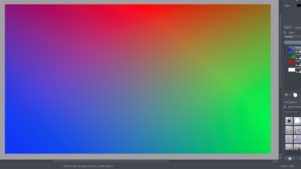
Here is a fun painting I did in my free time to keep on testing Krita before the next update release.

“Lobo vs the Mutant-Squirrel” ( Lobo is a character of DC Comics; Mutant-Squirrel is just a random mutant-squirrel 😛 )
Lobo vs Mutant-Squirrel

For this one, I’ve worked on a 16bit/channel canvas, using scRGB color space. Then in the end I’ve converted the final output to 8bit sRGB with Perceptual rendering intent.
You may ask: “Why is that better than default 8bit sRGB for painting then?”

Here is my answer, I’ll try to make it simple:
-sRGB is the default color space used by monitors, and usually directly applied by default on any image (or only on images missing color profile infos on color-managed software).
-The sRGB color space have a non-linear curve, which means that the scale of values is not linear relative to real lightness of the colors.
-a 8bit color space has only 256 different values for each color channel. That is quite limited.

-The scRGB is a wide gamut color space;
-scRGB have a linear curve, the values increase proportionally to the real lightness of the colors.
-8bit/channel is not enough to get precision with such linear curve, that’s the reason to use 16bit (65536 values/channel)

If those words still sound abstract to you, here are visual examples:

-In Krita, I’ve made a test example on 3 working color spaces: default sRGB, ROMM RGB (which has wide gamut too, but not linear), and scRGB.
On each one, I’ve made color-to-transparent gradients of pure red, green and blue on separate layers. The results show how the different color spaces blend the layers together.
sRGB:
sRGB
(You can see luminosity is not regular depending on the color shades/mixs)

ROMM RGB:
ROMM RGB
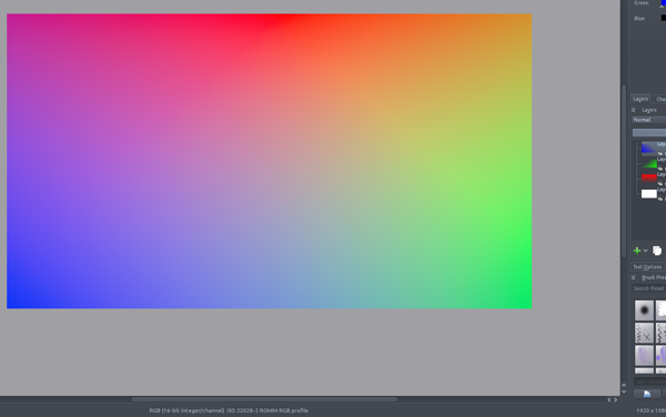
(It’s already better, as this color space is more adapted to 16bit encoding… not very linear but nice color shades)
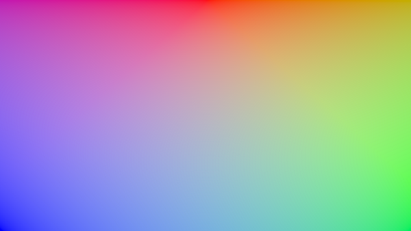
scRGB:
scRGB
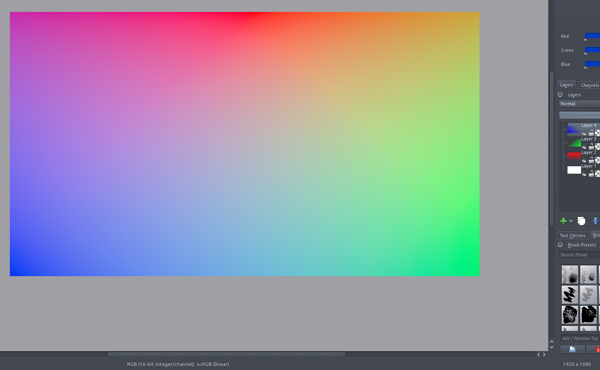
(That’s pretty good )

Another test, more real-life painting workflow: on each one, I’ve made a simple shape of pure red. In the center, an overlapping oval of pure blue at 50% opacity; on the right, a stroke of “color-smudge” brush mixing progressively pure blue; on the left, same thing but with pure green.
Results in the same order (sRGB, ROMM-RGB, scRGB):

painting strokes test
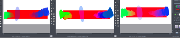
Here we can clearly see that mixing colors in linear color space gives more vivid colors (and that other color spaces might give other intersting mix results to experiment with for the adventurers… )

Working in different specific color-spaces like this is another reason why it’s very important to have your screen calibrated, so the color-management software has a way to control precisely the color conversion to the screen, and display accurate colors.
Anyway I’ve read that scRGB is meant to be backward-compatible with sRGB, so conversion should give similar result even for work made on non-calibrated screen.

On a side note, while I’m talking about color spaces, I’d like to mention Synfig studio.
There’s not much documentation on the internal color space used by synfig, except that it’s linear and using 16bit floating point.
So I’ve made the same gradient-test as above, and result looks like this:

Synfig colors
The result is very similar to the scRGB test in Krita; I’m still not sure if that’s exactly the same profile, but it’s pretty close. I did some more precise tests on this using a desktop-screen-color-picker, picking on both Krita and Synfig studio, and color name/hex value results always have really tiny differences, but that may be due to the lack of external color-management support from synfig compared to Krita (at least I suppose, as I didn’t see anything related in the settings… ). Anyway that’s already awesome from synfig to use such powerful color space from the begining.

I hope this can help you to choose the right color space next time you start a file in Krita!
If you find out I said anything wrong, your knowledge is welcome 😉

Posted in FLOSS, Illustrations | Tagged as: , , , , ,

LGM 2012 : Krita Workshop report

More details about the Krita workshop I made at Libre Graphics Meeting last week:

The goal of this workshop was to teach my workflow to use Krita for comics-style drawing.
After some explanations about my hardware and shortcuts setup (as some of you may know I use a joypad for all my shortcuts, using Qjoypad to map the keys, as my tablet-setup desn’t allow me for a keyboard access easily), I started opening a sketch of a “Libre Graphics Captain” super-hero that I prepared for the occasion:

Libre Graphics Captain - base

Then I explained how I ink and color it quickly. For the ink, most important points are to choose the right presets, and to be confortable drawing energic strokes , using a lot the canvas pan and rotation shortcuts to adapt the canvas position to your movement. Then for color, a first step to fill the areas with base colors, then a few layers over it using blending modes to apply shadows and highlights, using the “layer groups + alpha disable” mask trick, and a final layer using color-smudge brush to paint details/corrections. I did the demo on the face only, to fit the workshop timing; also I added a few modifications following the audience suggestions 😉 :

Libre Graphics Captain - lgm2012

Then I finished it at home, here is the final result (you can notice I’ve re-painted all the light as I made them in the wrong direction at the workshop 😛 …) :
Libre Graphics Captain - Finished

Again I want to say that I’m very happy of how the place was filled with great people and everyone was very interested, asking good questions.
Thanks for coming!

Posted in Comics, FLOSS, Illustrations | Tagged as: , , ,

New brush engine mode in Krita: blend like in Mypaint

A few days ago, while I was away on LGM, Silvio Heinrich (a cool coder -and- painter from the Krita team) added the new Dulling mode to his “Color smudge” engine.
So it’s now possible, in the “Smudge Rate” properties panel of this brush engine, to choose between “Smearing” or “Dulling” Smudge modes.
“Smearing” is the old behavior (morel like a classic smudge)
“Dulling” is the new mode, doing color mix similar to mypaint or other famous painting softwares.

This is a very good news, so I’ve already added 3 presets in the default pack using this wonderful feature.

Here is a screenshot showing a quick flower painted mostly with this engine (except the light effect at the center);
Also you can see the added presets, which are the “purple strokes” ones.

More paint in Krita

I Love this Brush

Posted in FLOSS | Tagged as: , , ,