Here is a fun painting I did in my free time to keep on testing Krita before the next update release.
“Lobo vs the Mutant-Squirrel” ( Lobo is a character of DC Comics; Mutant-Squirrel is just a random mutant-squirrel 😛 )

For this one, I’ve worked on a 16bit/channel canvas, using scRGB color space. Then in the end I’ve converted the final output to 8bit sRGB with Perceptual rendering intent.
You may ask: “Why is that better than default 8bit sRGB for painting then?”
Here is my answer, I’ll try to make it simple:
-sRGB is the default color space used by monitors, and usually directly applied by default on any image (or only on images missing color profile infos on color-managed software).
-The sRGB color space have a non-linear curve, which means that the scale of values is not linear relative to real lightness of the colors.
-a 8bit color space has only 256 different values for each color channel. That is quite limited.
-The scRGB is a wide gamut color space;
-scRGB have a linear curve, the values increase proportionally to the real lightness of the colors.
-8bit/channel is not enough to get precision with such linear curve, that’s the reason to use 16bit (65536 values/channel)
If those words still sound abstract to you, here are visual examples:
-In Krita, I’ve made a test example on 3 working color spaces: default sRGB, ROMM RGB (which has wide gamut too, but not linear), and scRGB.
On each one, I’ve made color-to-transparent gradients of pure red, green and blue on separate layers. The results show how the different color spaces blend the layers together.
sRGB:
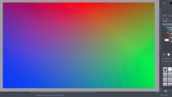
(You can see luminosity is not regular depending on the color shades/mixs)
ROMM RGB:
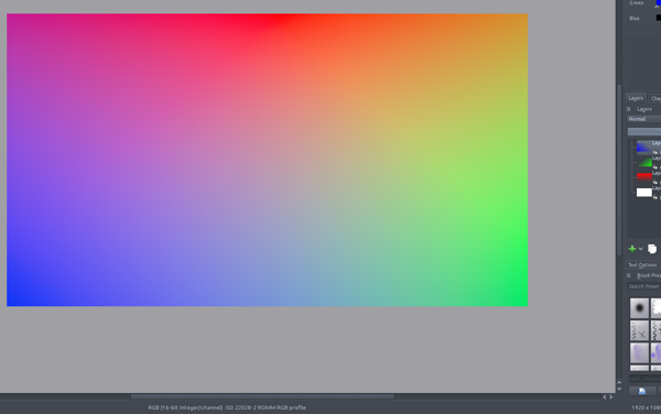
(It’s already better, as this color space is more adapted to 16bit encoding… not very linear but nice color shades)
scRGB:
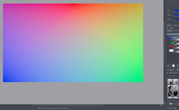
(That’s pretty good )
Another test, more real-life painting workflow: on each one, I’ve made a simple shape of pure red. In the center, an overlapping oval of pure blue at 50% opacity; on the right, a stroke of “color-smudge” brush mixing progressively pure blue; on the left, same thing but with pure green.
Results in the same order (sRGB, ROMM-RGB, scRGB):

Here we can clearly see that mixing colors in linear color space gives more vivid colors (and that other color spaces might give other intersting mix results to experiment with for the adventurers… )
Working in different specific color-spaces like this is another reason why it’s very important to have your screen calibrated, so the color-management software has a way to control precisely the color conversion to the screen, and display accurate colors.
Anyway I’ve read that scRGB is meant to be backward-compatible with sRGB, so conversion should give similar result even for work made on non-calibrated screen.
On a side note, while I’m talking about color spaces, I’d like to mention Synfig studio.
There’s not much documentation on the internal color space used by synfig, except that it’s linear and using 16bit floating point.
So I’ve made the same gradient-test as above, and result looks like this:
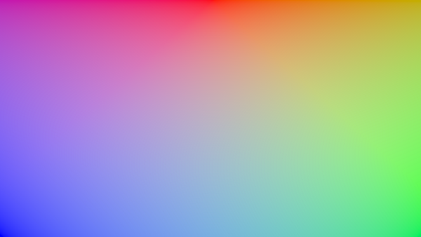
The result is very similar to the scRGB test in Krita; I’m still not sure if that’s exactly the same profile, but it’s pretty close. I did some more precise tests on this using a desktop-screen-color-picker, picking on both Krita and Synfig studio, and color name/hex value results always have really tiny differences, but that may be due to the lack of external color-management support from synfig compared to Krita (at least I suppose, as I didn’t see anything related in the settings… ). Anyway that’s already awesome from synfig to use such powerful color space from the begining.
I hope this can help you to choose the right color space next time you start a file in Krita!
If you find out I said anything wrong, your knowledge is welcome 😉


[…] Krita: Si os estáis iniciando con Krita, es posible que os interese este artículo publicado en el blog de Timothée Giet, donde explican un poco el tema de los espacio de […]
[…] Krita: Si os estáis iniciando con Krita, es posible que os interese este artículo publicado en el blog de Timothée Giet, donde explican un poco el tema de los espacio de […]